Solysit - A Service Marketplace
This user experience was designed for a project in DES 3131- User Experience in Design.
This assignment was designed to give students a full understanding of UX Research and Design.
This project took 7 weeks between September and October of 2019.
Projects were assigned individually. I had the following responsibilities for this project:
 |
 |
 |
 |
After a couple brainstorming exercises I came up with the idea for an elderly-assistance app. While I was making a user empathy map I realized that what I was designing could expand out to a much wider audience than just elderly people. Finally I settled on the idea of creating a service market place.
Solysit is an app that connects users who need services like yardwork, maintenance, or cleaning, with users who are looking for work or supplemental income.
I centered in on three competitors to analyze: Craigslist, TaskRabbit, and Upwork.
These websites did a lot of really nice things:
They also had a few faults:
Craigslist is primarily for peer to peer sales, their service component is therefore peer to peer. Both Upwork and TaskRabbit are geared towards connecting users to professionals. What I hoped to build with Solysit was a peer to peer service, with the same user base as Craigslist, while maintaining the same level of trust that services like Upwork and TaskRabbit thrive on.
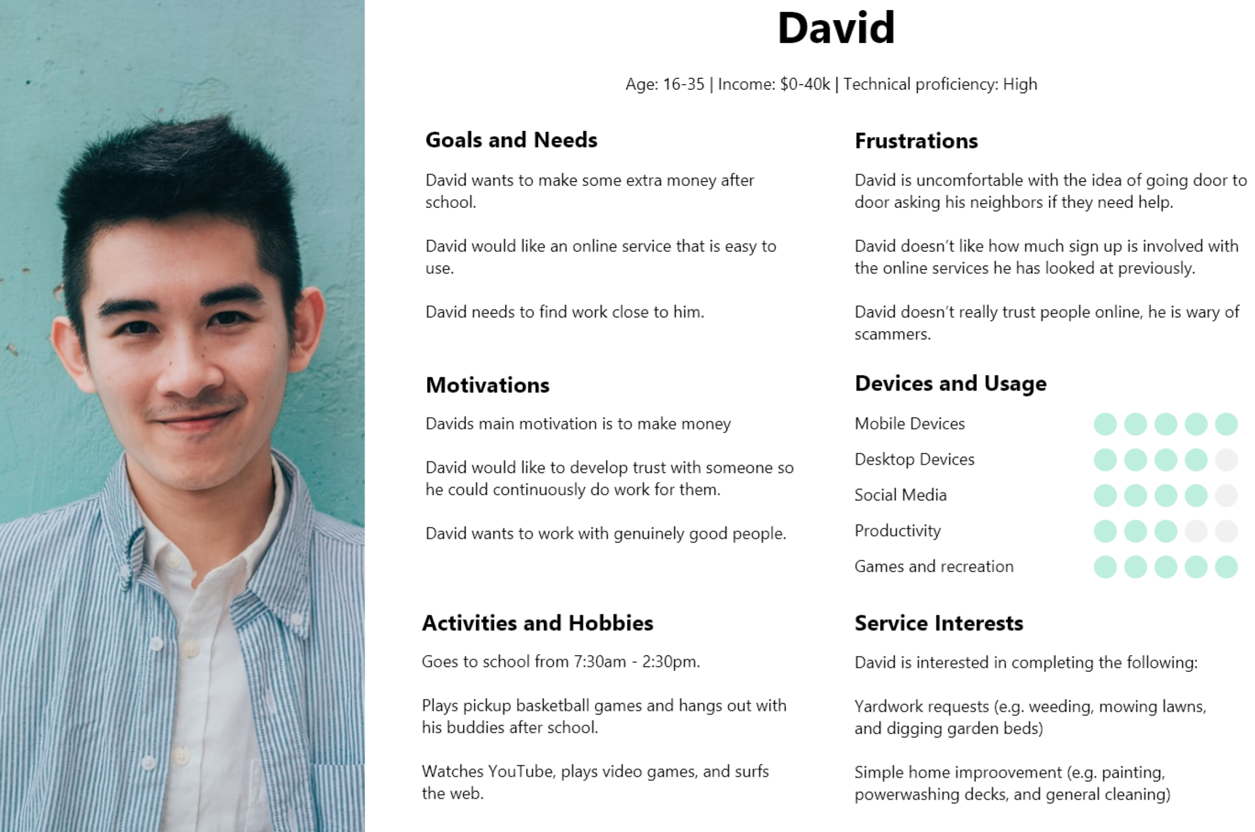
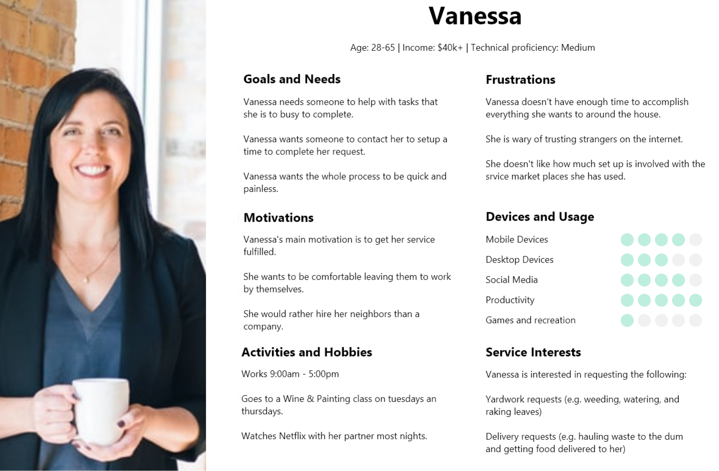
After settling on a service marketplace, I created two personas to ensure my designs stayed user focused. David represents a user that is looking for work and Vanessa represents a user that is looking for help.
Through a competitive analysis and creating user empathy maps, I focused on three common pain points for users:
Accounting for these insights, I set out to develop an experience that
I started with a user flow to map the ideal user experience. Given the constraints of this project I had to keep the flow and the overall design short and simple.
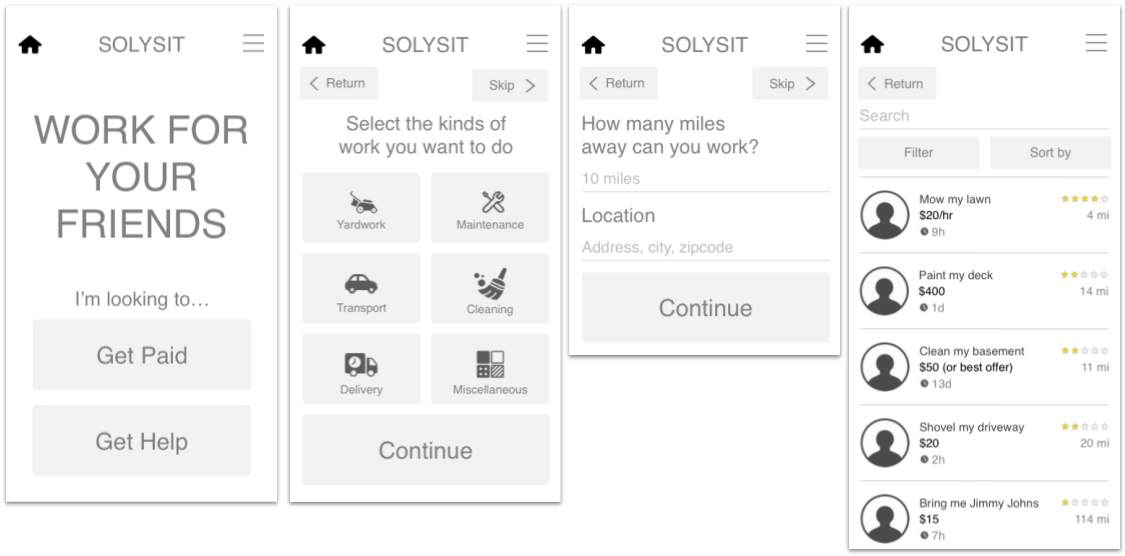
Since I included simple illustrations for each screen in my user-flow, I had a good idea on how I wanted the first set of wires to look.
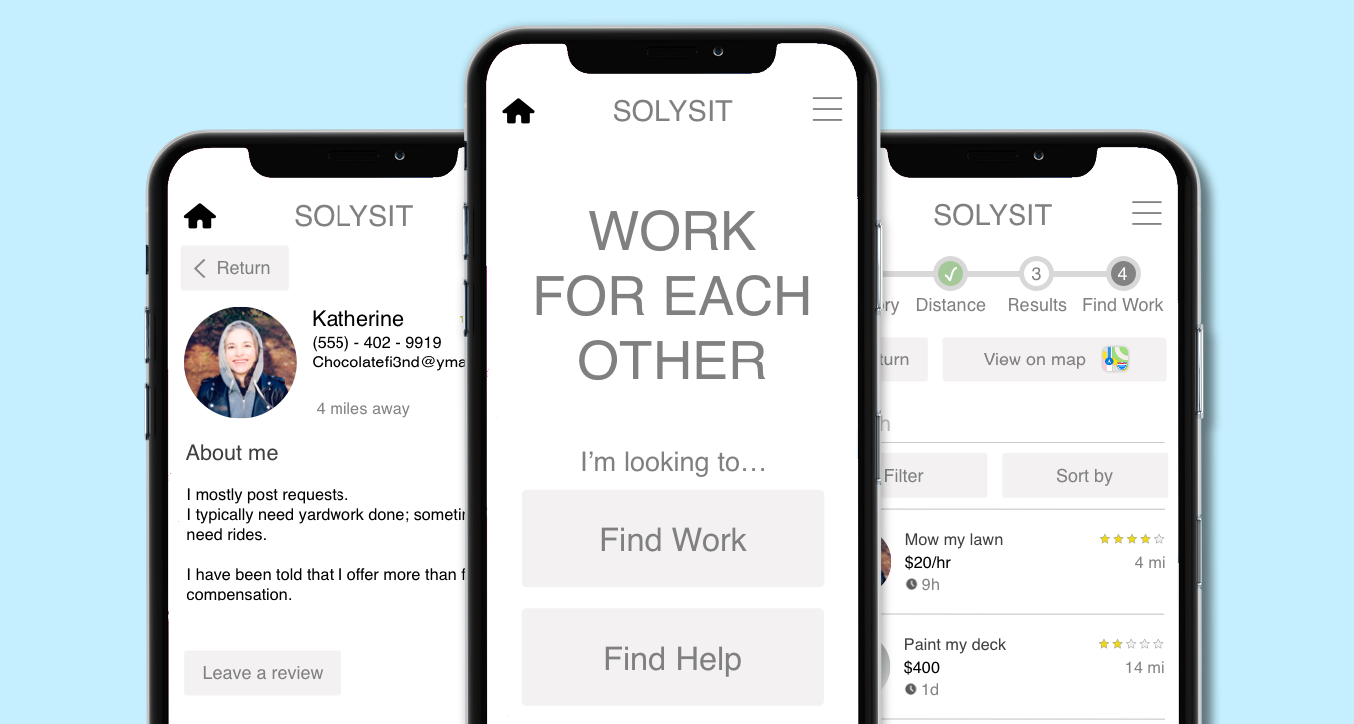
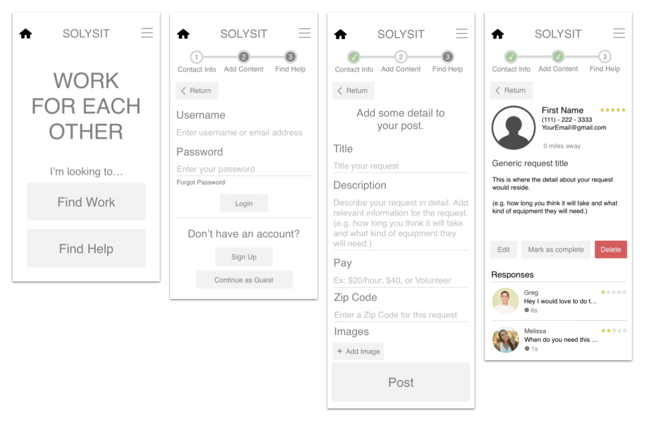
Next I digitized my wireframes. At this point in my project I was working on a Dell XPS laptop and did not have access to Sketch. I used a program called Lunacy to create sketch files for my wireframes. This high-fidelity draft is where I introduced a lot of copy. I had 5 screens at this stage here is how they looked:
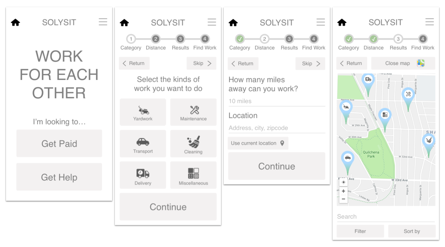
After a peer review and a lot of helpful feedback I redesigned my screens for a clickable prototype. Using Invision I drafted a clickable prototype to present to users during my user testing. Here is a link to the final clickable prototype.
I performed three rounds of user testing and redesigned portions of Solysit after each round.
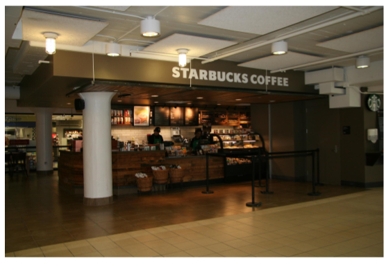
In this round of user testing I interviewed college students in Coffman Memorial Union at the University of Minnesota. Here are some of the takeaways from this round of user testing:
After this round of testing and at the suggestion of my Professor McLean Donnelly, I purchased a Macbook Pro and rebuilt my screens in Sketch. Some of the improvements included:
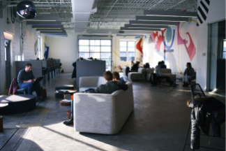
In this round of user testing I interviewed customers at a Spyhouse coffee in downtown Minneapolis. Here are some of the takeaways from this round of user testing:
.png)
After this round of testing I felt pretty confident in my designs and made fewer adjustments than the first round of testing:
In this final round of user testing I interviewed two customers at Dogwood Coffee and three customers at Spyhouse coffee in Northeast Minneapolis. Here are some of the takeaways from this round of user testing:
After this round of testing I felt that Solysit was close to its final state making only the following adjustments:
At the beginning of this project I set out with the goal to gain a comprehensive understanding of UX design. This project has certainly helped me do that:
I learned a lot about User Experience Design throughout this project. Here are the three key takeaways that will strengthen my designs in the future: